DESKTOP LANDING PAGE - FINAL ITERATION
DESKTOP LANDING PAGE - FINAL ITERATION
DESKTOP LANDING PAGE - FINAL ITERATION


interior
Studio
Huang
MAKING
OF
MAKING
OF
MAKING
OF
EARLY DEVELOPMENTS
INSPIRATION
EARLY
DEVELOPMENTS
EARLY
DEVELOP-
MENTS
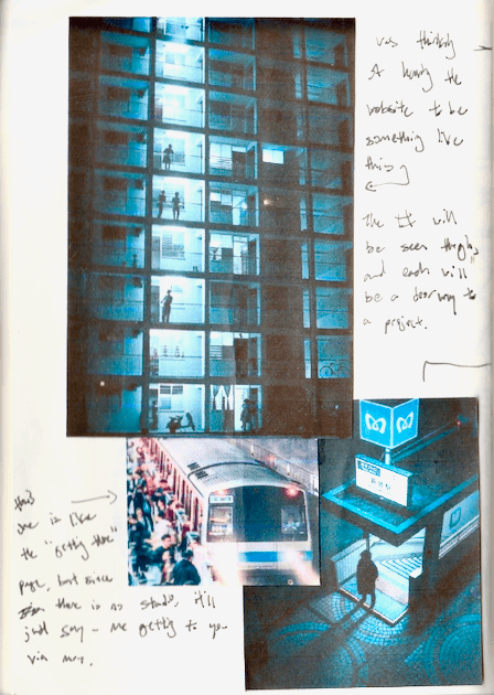
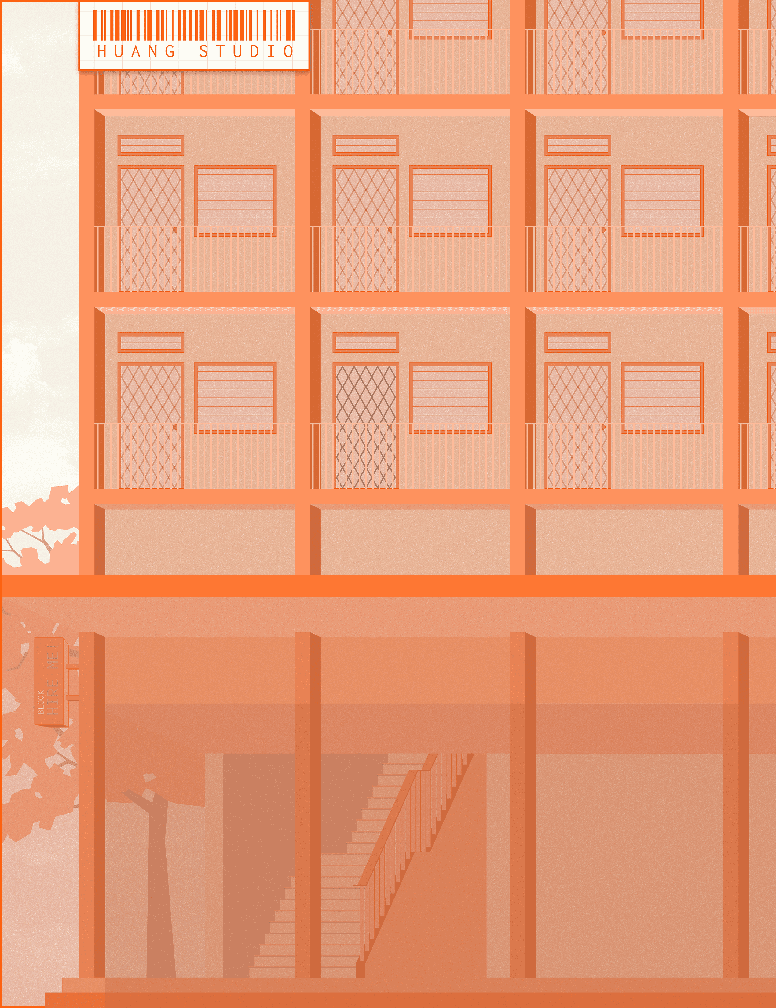
The inspiration came from browsing through Pinterest. The flat in the picture reminded me of the buildings I used to visit during my service. Initially, the flow of the site was meant for the user to come home from work from the MRT station, and I had planned for the site to start from the bottom and the viewer would scroll up.
Throughout my process of this website, my goal was to spark curiosity, aiming to create an experience reminiscent of playing a new game.
I have to constantly remind myself that this is a website, and it should still look and feel like a website.




LANDING PAGE
LANDING PAGE
ANIMATION
ANIMATION


ITERATION 01
↱
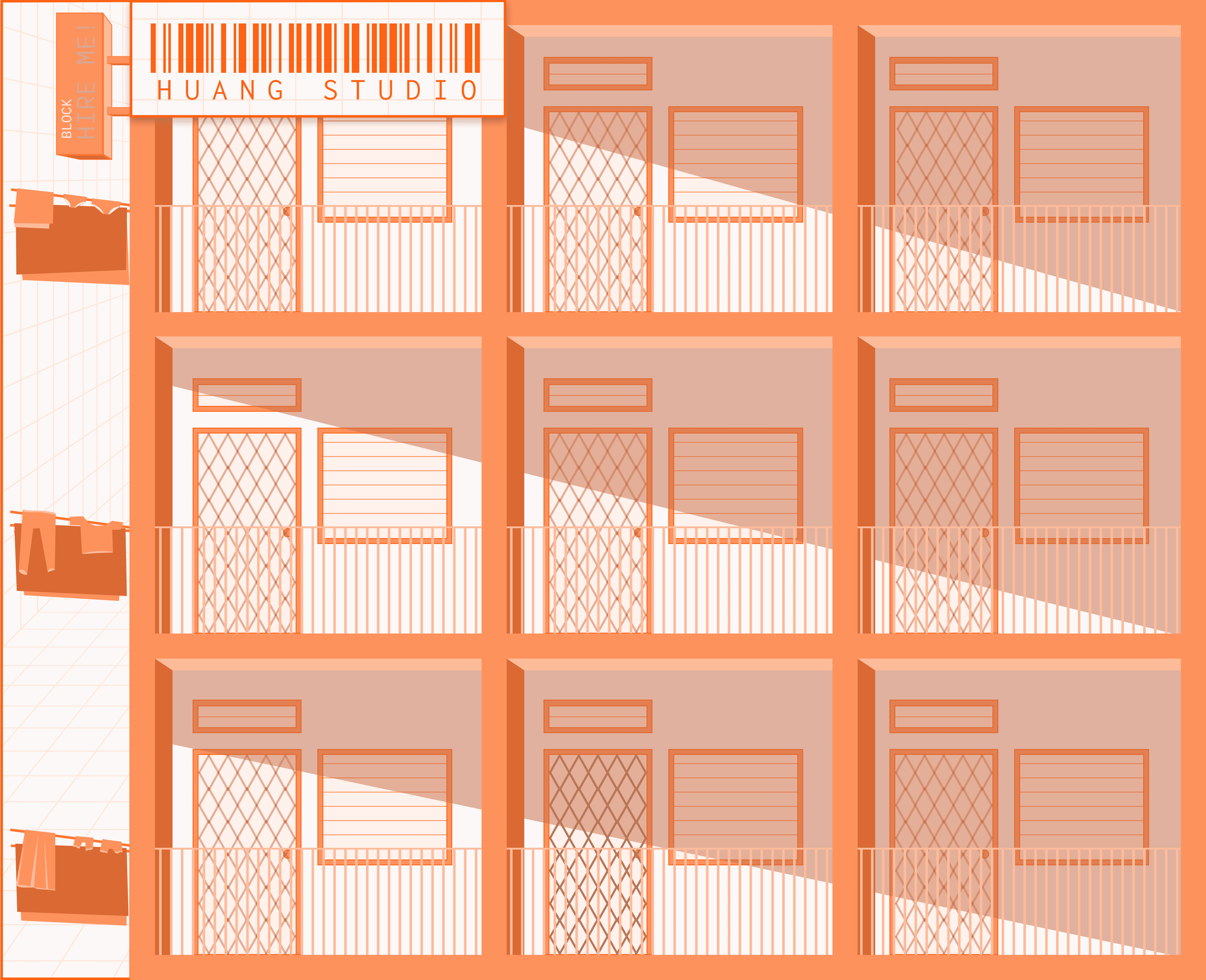
The individual unit functions as individual portals to each project
The void deck was meant to showcase things [update later]
—-->
—-->


—-->
—-->
ITERATION 02
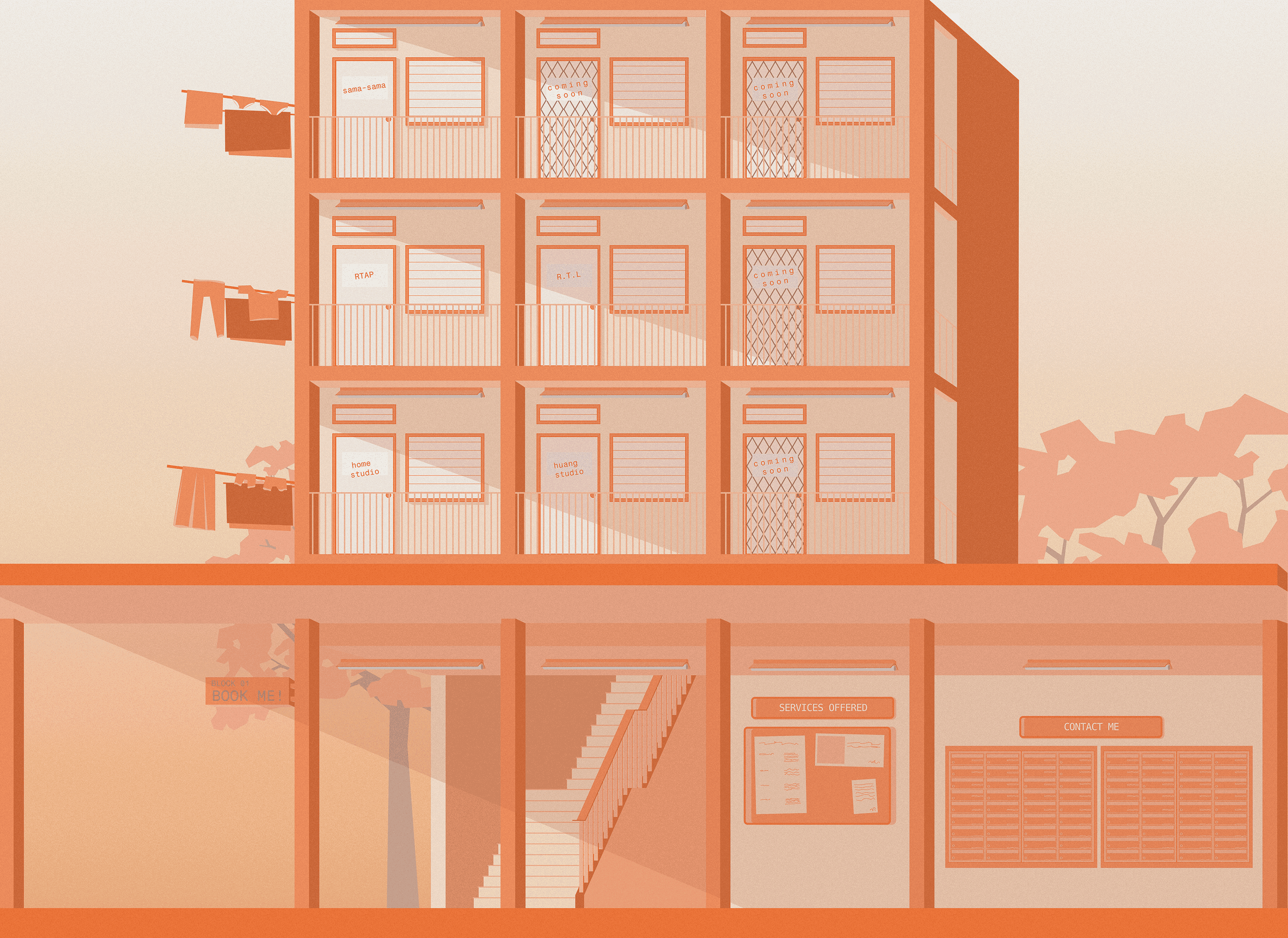
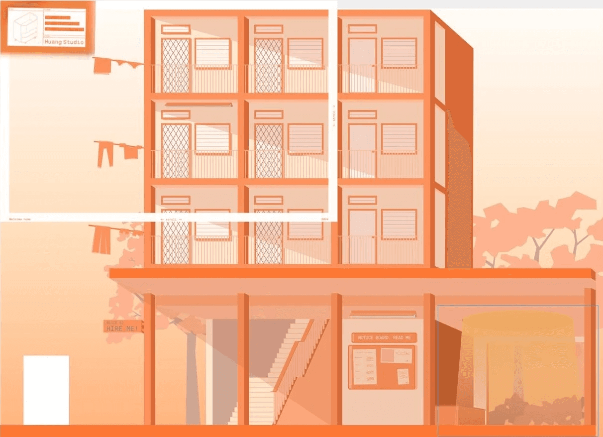
In the second iteration, the inclusion of the void deck is introduced.
The website is designed to be divided into two distinct sections, with the top half dedicated to showcasing projects, while the bottom half is dedicated to providing information. Each unit is presented as a project, mirroring the organization found in real-life scenarios.
The individual unit functions as individual portals to each project
The individual unit functions as individual portals to each project
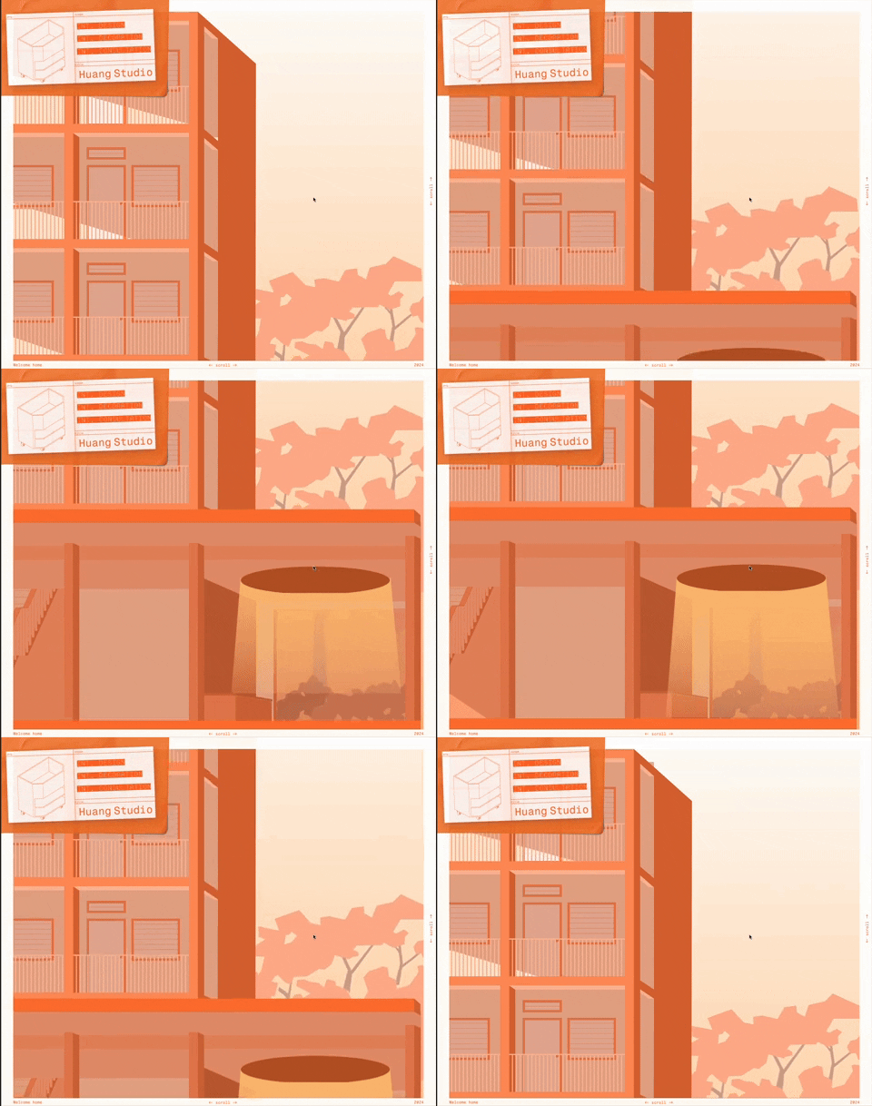
The void deck was meant to showcase things [update later]
The void deck was meant to showcase things [update later]
↱
↱


ITERATION 02.1
ITERATION 02.1
OVERALL LANDING PAGE LANDING PAGE
OVERALL LANDING PAGE LANDING PAGE
VOID LIGHT // ANIMATION [TESTING]
VOID LIGHT //
ANIMATION TESTING
VOID LIGHT // ANIMATION [TESTING]
↱










4TH FLOOR
3RD FLOOR
2ND FLOOR
These subtle elements portray everyday objects that we often take for granted, seldom pausing to consider their significance.
I am inclined towards showcasing these commonplace elements, with the intention of celebrating our way of life rather than obscuring it.
These subtle elements portray everyday objects that we often take for granted, seldom pausing to consider their significance.
I am inclined towards showcasing these commonplace elements, with the intention of celebrating our way of life rather than obscuring it.
These subtle elements portray everyday objects that we often take for granted, seldom pausing to consider their significance.
I am inclined towards showcasing these commonplace elements, with the intention of celebrating our way of life rather than obscuring it.
ELEMENTS
ELEMENTS
SERVICES OFFERED
SERVICES OFFERED
SERVICES OFFERED
CONTACT ME
CONTACT ME
NOTICE BOARD
NOTICE BOARD
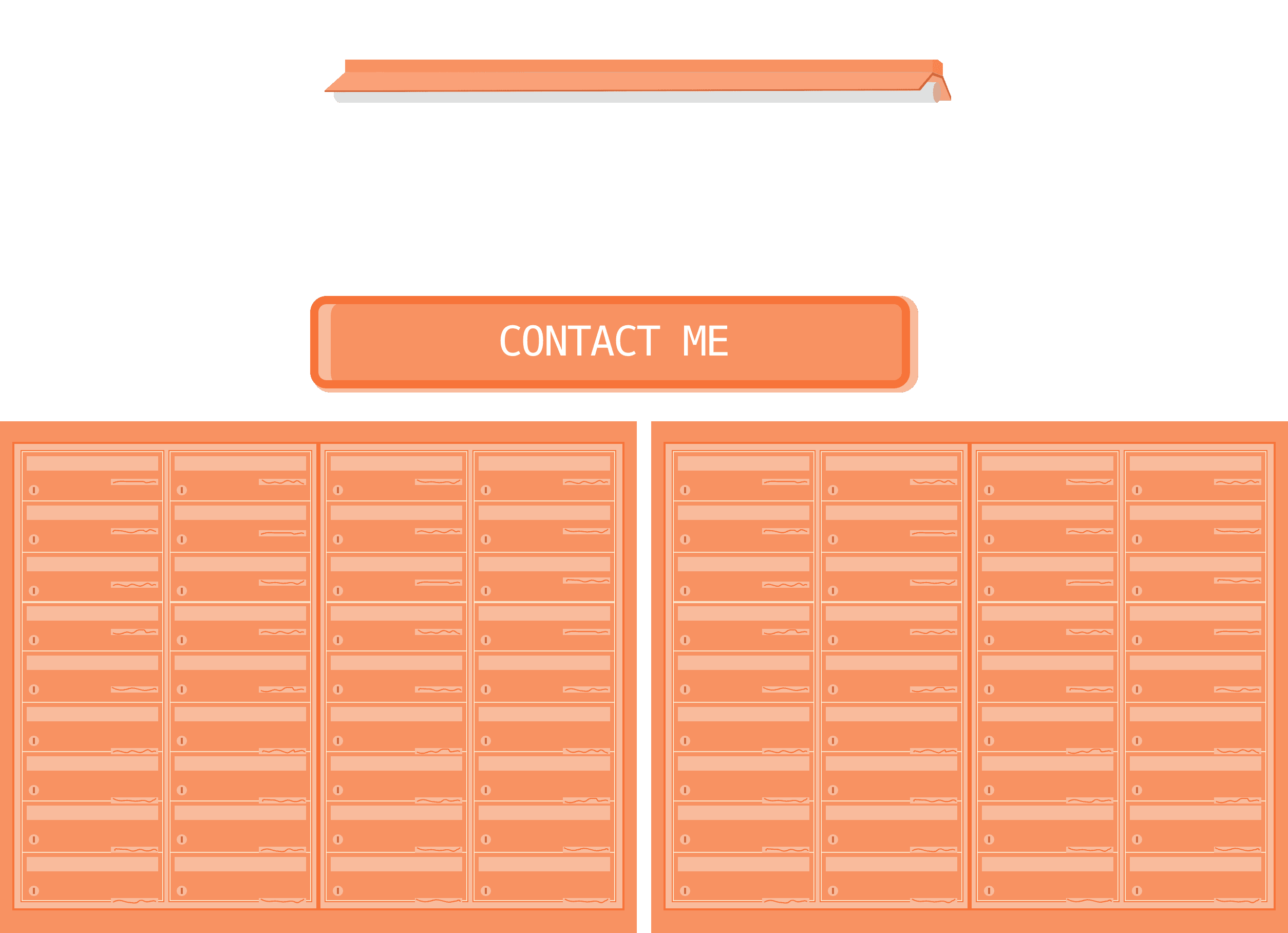
LETTER BOX
LETTER BOX
LETTER BOX
UNIT COMBO
UNIT COMBO

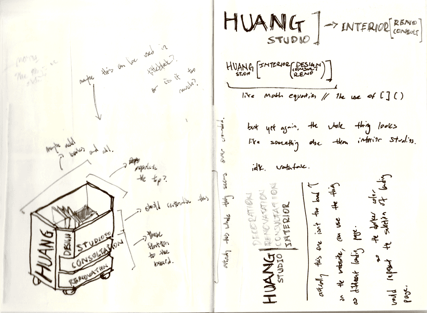
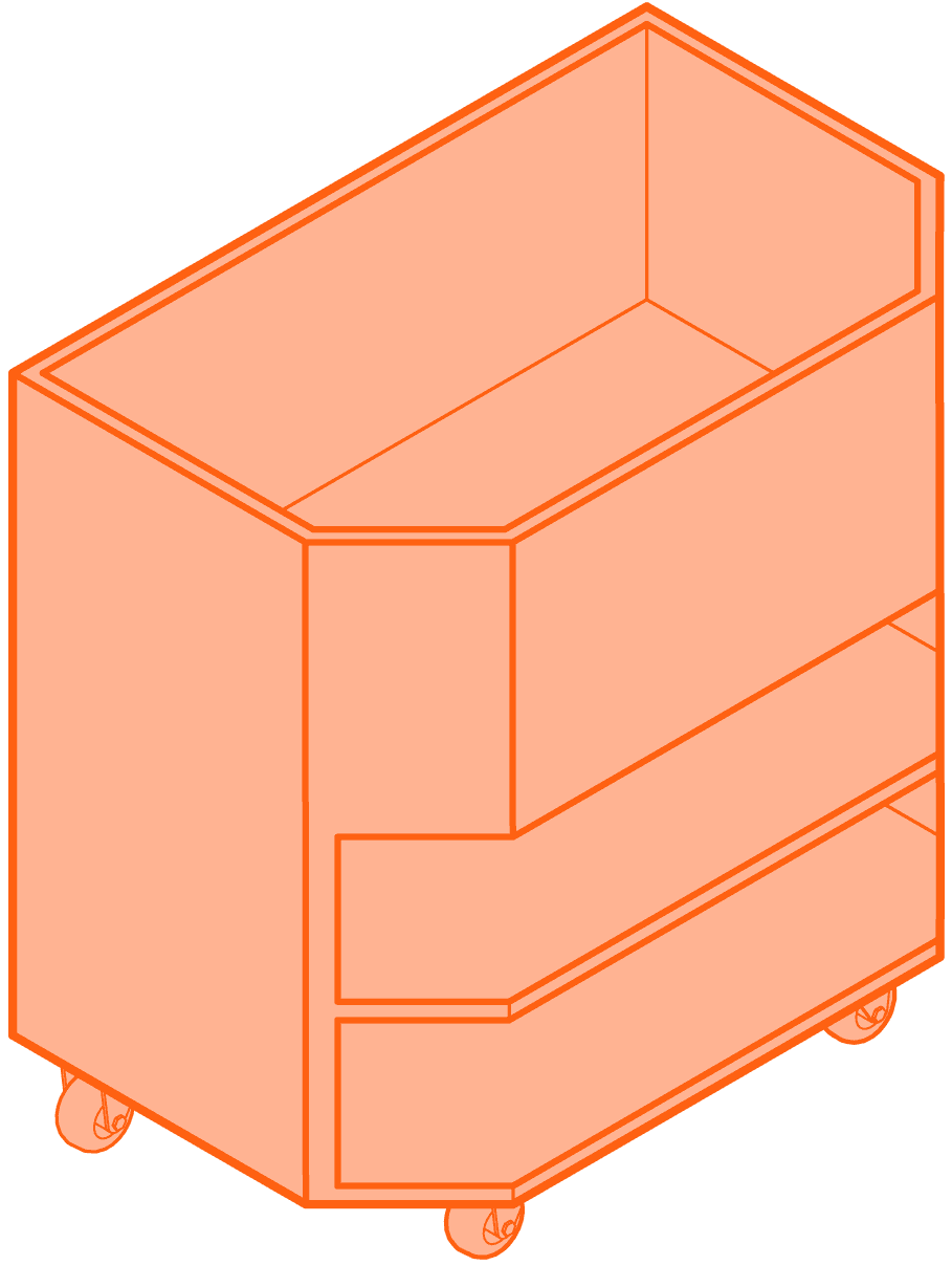
While it is understandable that "HUANG"【黄】translates to yellow in Mandarin, I personally find that orange better encapsulates my personality and concept. The aspiration to establish my own workspace for honing my craft has been a longstanding goal, albeit one approached gradually.
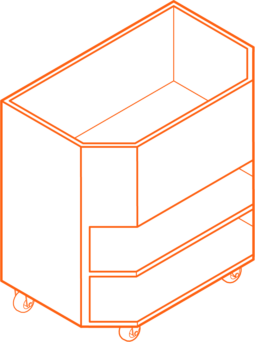
The shelf, originally a component of my previous project,
Home Studio, caught my attention due to its mobility.
Transforming it into a vector graphic accentuated
its appeal, and I found the outcome to be
particularly gratifying.
While it is understandable that "HUANG"【黄】translates to yellow in Mandarin, I personally find that orange better encapsulates my personality and concept. The aspiration to establish my own workspace for honing my craft has been a longstanding goal, albeit one approached gradually.
The shelf, originally a component of my previous project, Home Studio, caught my attention due to its mobility.Transforming it into a vector graphic accentuated its appeal, and I found the outcome to be particularly gratifying.
While it is understandable that "HUANG"【黄】translates to yellow in Mandarin, I personally find that orange better encapsulates my personality and concept. The aspiration to establish my own workspace for honing my craft has been a longstanding goal, albeit one approached gradually.
The shelf, originally a component of my previous project,
Home Studio, caught my attention due to its mobility.
Transforming it into a vector graphic accentuated
its appeal, and I found the outcome to be
particularly gratifying.


IDENTITY
IDENTITY
IDE-
NTITY
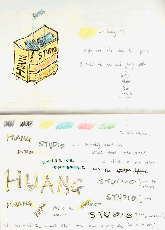


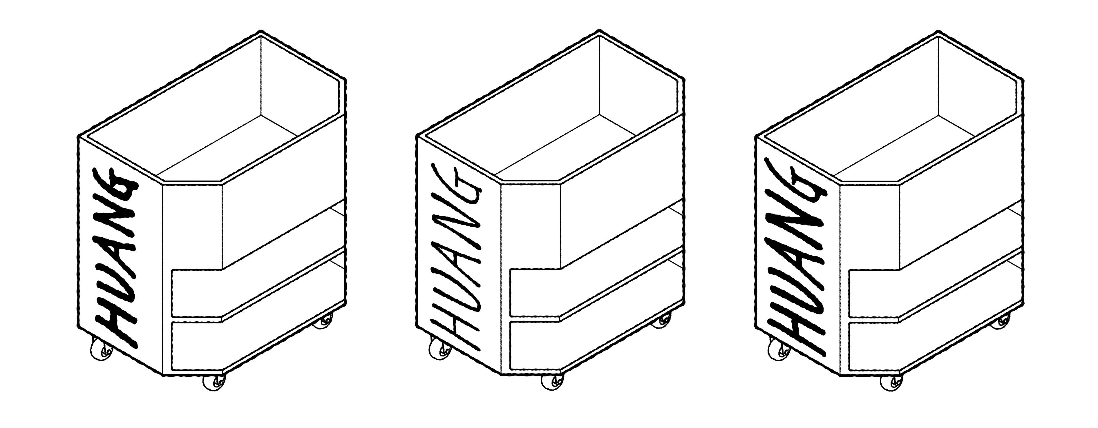


EARLY ITERATIONS OF LOGO [DIGITAL]
EARLY ITERATIONS OF LOGO [DIGITAL]


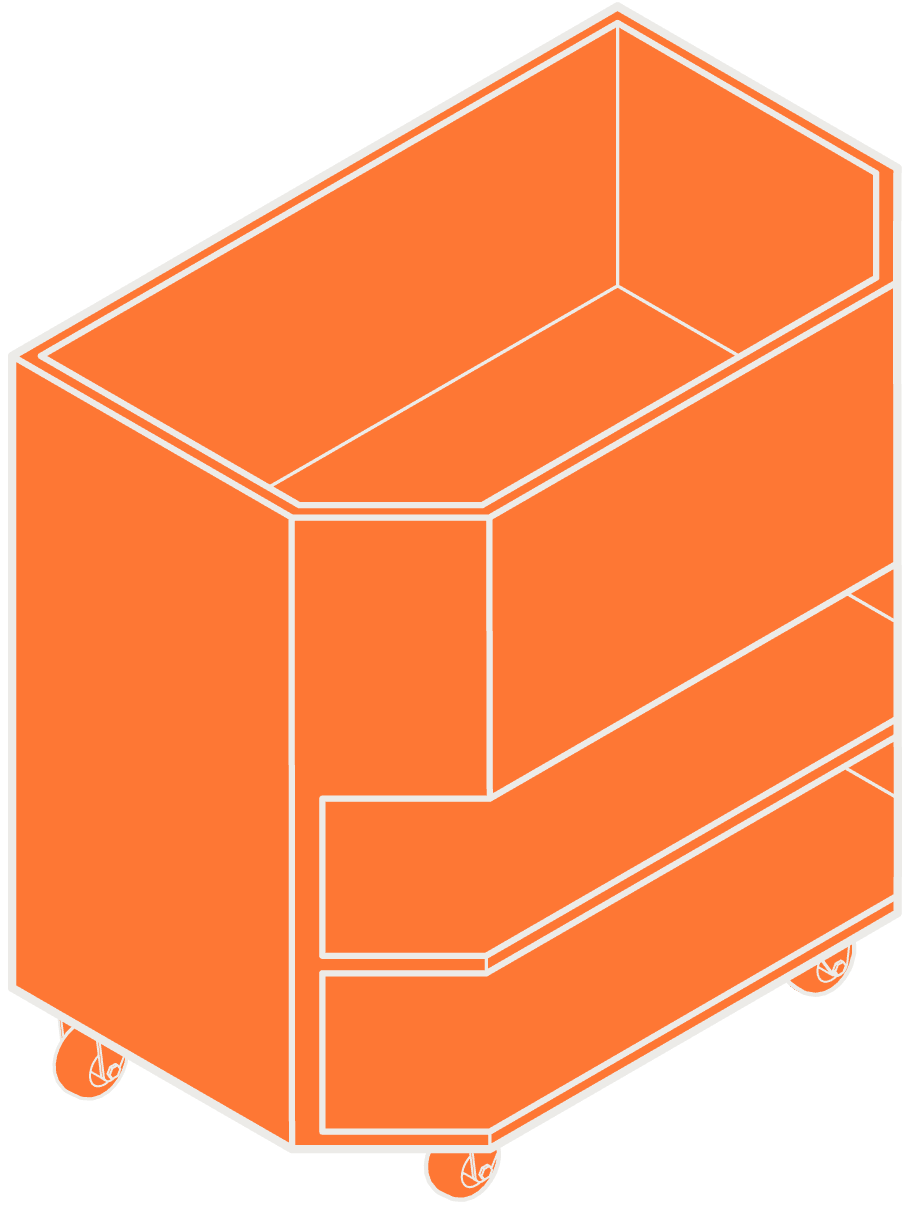




FINAL ITERATIONS OF LOGO [DIGITAL]
FINAL ITERATIONS OF LOGO [DIGITAL]








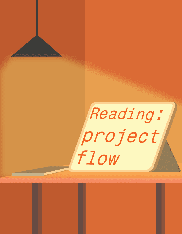















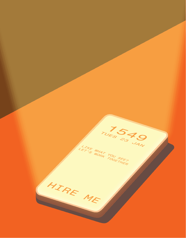








Within the website, buttons serve functional purposes, I took the opportunity to infuse them with personality through custom graphics. This approach follows games, where each skill is visually represented by an illustration depicting its effect and function.
Within the website, buttons serve functional purposes, I took the opportunity to infuse them with personality through custom graphics. This approach follows games, where each skill is visually represented by an illustration depicting its effect and function.
<-ICONS
ICONS
ICONS
The conceptualisation behind each graphic aims to vividly portray the dynamics inherent in our everyday actions—capturing the essence of mundane activities often overlooked. Take, for instance, the representation of a phone; it symbolises the initiation of communication. Typically facilitated through social and messaging applications, the graphic serves as a visual embodiment of the inception of such interactions.
The conceptualisation behind each graphic aims to vividly portray the dynamics inherent in our everyday actions—capturing the essence of mundane activities often overlooked. Take, for instance, the representation of a phone; it symbolises the initiation of communication. Typically facilitated through social and messaging applications, the graphic serves as a visual embodiment of the inception of such interactions.
The conceptualisation behind each graphic aims to vividly portray the dynamics inherent in our everyday actions—capturing the essence of mundane activities often overlooked. Take, for instance, the representation of a phone; it symbolises the initiation of communication. Typically facilitated through social and messaging applications, the graphic serves as a visual embodiment of the inception of such interactions.
The phone symbolizes the action of reaching for your device and initiating contact with someone else.
The phone symbolises the action of reaching for your device and initiating contact with someone else.
The phone symbolizes the action of reaching for your device and initiating contact with someone else.
The tablet icon embodies the process of conducting research and exploring options before making a commitment, reflecting the typical approach to decision-making and scouting possibilities.
The tablet icon embodies the process of conducting research and exploring options before making a commitment, reflecting the typical approach to decision-making and scouting possibilities.
The tablet icon embodies the process of conducting research and exploring options before making a commitment, reflecting the typical approach to decision-making and scouting possibilities.
The book symbolizes a journal containing all conceptualizations, each project meticulously crafted with thoughtful consideration and planning.
The book symbolizes a journal containing all conceptualizations, each project meticulously crafted with thoughtful consideration and planning.
The book symbolizes a journal containing all conceptualizations, each project meticulously crafted with thoughtful consideration and planning.
<-
<-
PHONE
ASSESTS
PHONE
ASSESTS
PHONE

The challenge arises from the substantial graphics featured on the desktop site's landing page. Replicating this on the mobile version poses difficulties, as the limited screen space makes scrolling potentially cumbersome without compromising the user experience.
I approached the phone site to be an abstraction of the desktop site, capturing the essence of it, and translating it onto a smaller screen.
It is recommended to view the site on a desktop for a better viewing experience!
A
S
S
E
S
T
S



INITIAL ITERATION
INITIAL ITERATION

Huang
Studio

PHONE MENU ITERATIONS
PHONE MENU
ITERATIONS
I really liked the idea of having a photo strip as a menu for the phone site, similar to the one of the desktop site. However, after consulting, it was deemed to be an hinderance to the user experience.
And thus, born the final iteration, an amalgamation of the photo strip, and menu.
I really liked the idea of having a photo strip as a menu for the phone site, similar to the one of the desktop site. However, after consulting, it was deemed to be an hinderance to the user experience.
And thus, born the final iteration, an amalgamation of the photo strip, and menu.
I really liked the idea of having a photo strip as a menu for the phone site, similar to the one of the desktop site. However, after consulting, it was deemed to be an hinderance to the user experience.
And thus, born the final iteration, an amalgamation of the photo strip, and menu.


<-
There were different inspirations for the menu, I wanted the menu to be something that we are familiar about ranging from product tags, to photo strips, stickers. After much deliberation, I decided to proceed with a photo strip.


There were different inspirations for the menu, I wanted the menu to be something that we are familiar about ranging from product tags, to photo strips, stickers. After much deliberation, I decided to proceed with a photo strip.
There were different inspirations for the menu, I wanted the menu to be something that we are familiar about ranging from product tags, to photo strips, stickers. After much deliberation, I decided to proceed with a photo strip.
PEERING THROUGH THE WINDOW
FROM INSIDE THE UNIT
PEERING THROUGH THE WINDOW
FROM INSIDE THE UNIT
GRAPHIC CONTAINING SEVERAL ICONS SEEN ABOVE
GRAPHIC CONTAINING SEVERAL ICONS
SEEN ABOVE
FINAL ITERATION
interior
Studio
Huang


interior
Studio
Huang
FURTHER UPDATES
COMING SOON :)
FURTHER UPDATES
COMING SOON
:)